The NYSE offers extensive historic data on it's website. Although it is not in Html format and Data Analytics does not support other formats yet, it is very simple to convert the data to a webpage. Here it is. Import that data in the application. Do not forget to skip one row at the beginning because of the units. Also the numbers in the first columns should be considered strings so make sure you override the correct data type while importing.
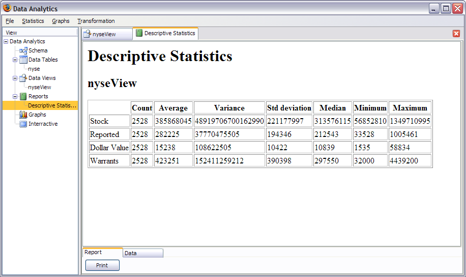
First of all, read this information concerning statistical reports. We'll first obtain descriptive statistics to get a good summary of the data we study. Go to statistics/ descriptive stats and select all aggregates and all fields. Here's the final report:

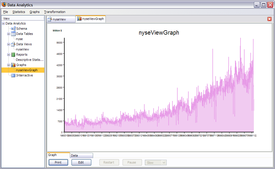
Now let's make a graph of the dollar value of transactions for the whole 1990s like we see on television.
Select an area plot of the dollar value field and select the date as the X axis. Put Million $ as the label on the first Y axis. You obtain:
Next, we'll separate the 10 years in different series and plot against the day of the year. Maybe we'll find some hidden information. First of all we need to create 2 fields one for the year and one for the day. We want the day to be numeric because it needs to be scattered (explained later).
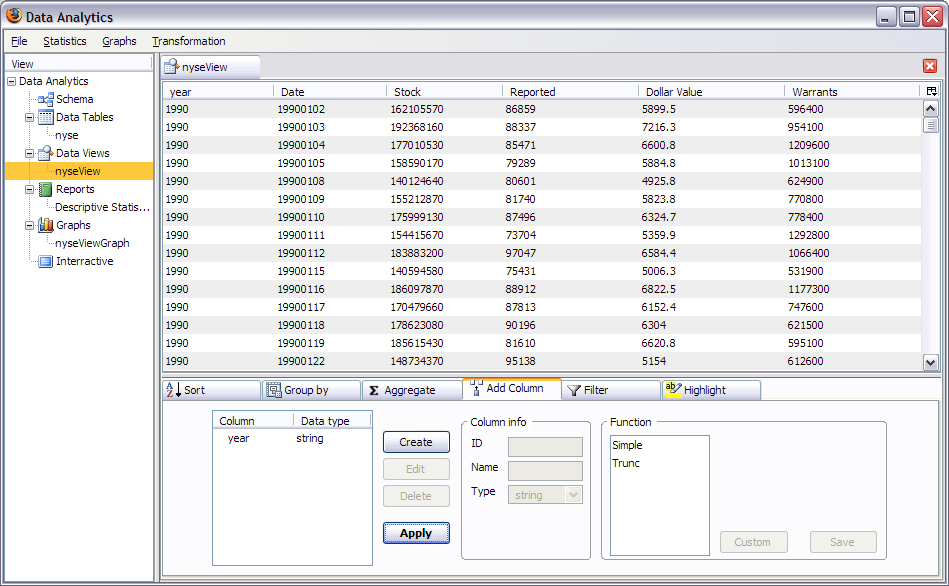
First, let's create the year. It's easy to see that the first four digits in the data is the year. To extract the date, we'll use the trunc function from 0 to 4. We obtain the following:
Next we'll create the day using a custom formula. Read this first. Create a new field of type number and click on custom. I'll give you the formula to enter but you could have found it easily:
function IntDayVal() {


        this.name = "IntDayVal";

        this.label = "IntDayVal";

        this.config = null;

        this.result = null;

        this.createConfig = (function () {

        return null;

        } );

        this.process = (function (row, table, index) {

                var s = new String(row['col0']);

        var m = s.substring(4,6);

        var d = s.substring(6);

                this.result = (Number(m)-1)*31+Number(d);

        } );


}
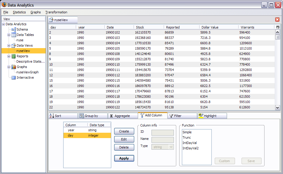
This formula is much shorter than the other examples (simple and trunc) because it does not have a visual interface (createConfig returns null). You might have to change the row['col0'] depending on whether you change the default column id in the importation wizard. Run this and you should get:
Let's now make the graph we wanted from the start. It's an image graph with one series based on the Dollar Value field but conditional to the year field. You'll get to this screen:
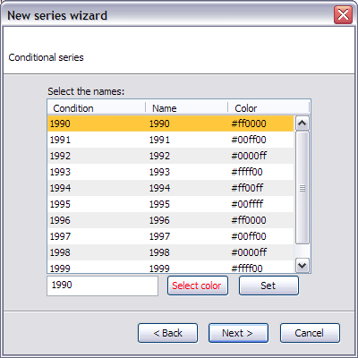
Here you can change the name and the colors of the series if you want. Select a line chart and 'day' as the x axis. Do not select the scatter option to understand what it does when you'll activate it. Don't forget to display the legend also. You should get:
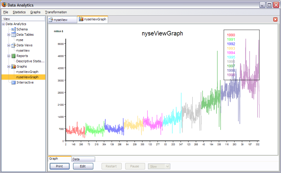
Notice how the x values are not linear. Now let's activate the scatter at X option by clicking on the edit button.

Now we get what we wanted: 10 years of NYSE data in this simple graph. You can see the effects of Christmas and Thanksgiving on the volume. (The single data points that goes backward in the 10th year is a bug...)
That's all for this tutorial. Have fun. try to create a bar chart with the data of your choice.