Your number theory teacher gives you an homework: to analyze the band structure of the Goldbach comet. Here is an explanation of the Goldbach conjecture for those who never heard of it. The Goldbach comet is actually a plot of of the number of pairs of prime numbers for a given even number x. The first step is to generate the first 32000 points with a homemade C++ program. Here's the output. Consider adjusting your dom.max_script_run_time since there is a lot of processing to be done. You can also run into Out of memory errors... The code is not optimized yet and it can take some time to import and process the data.
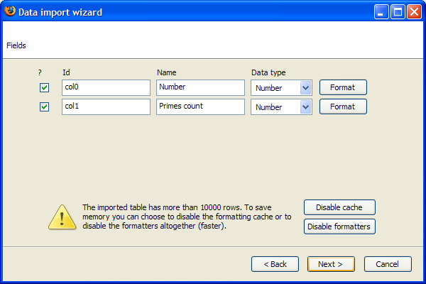
Let's import the data the usual way but wait for the document to be fully loaded. You will get the following warning:

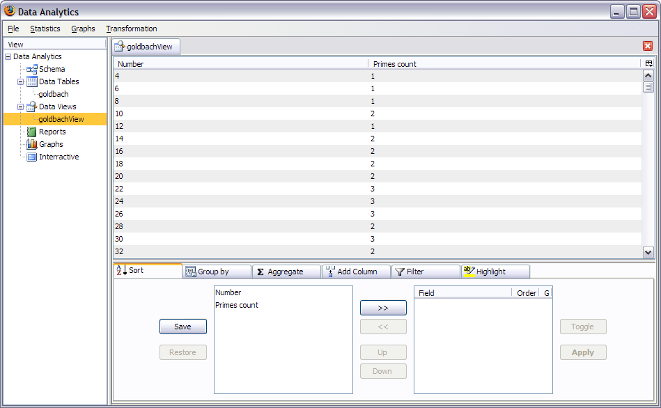
When you're done importing (can take a long time) you will get the main window:
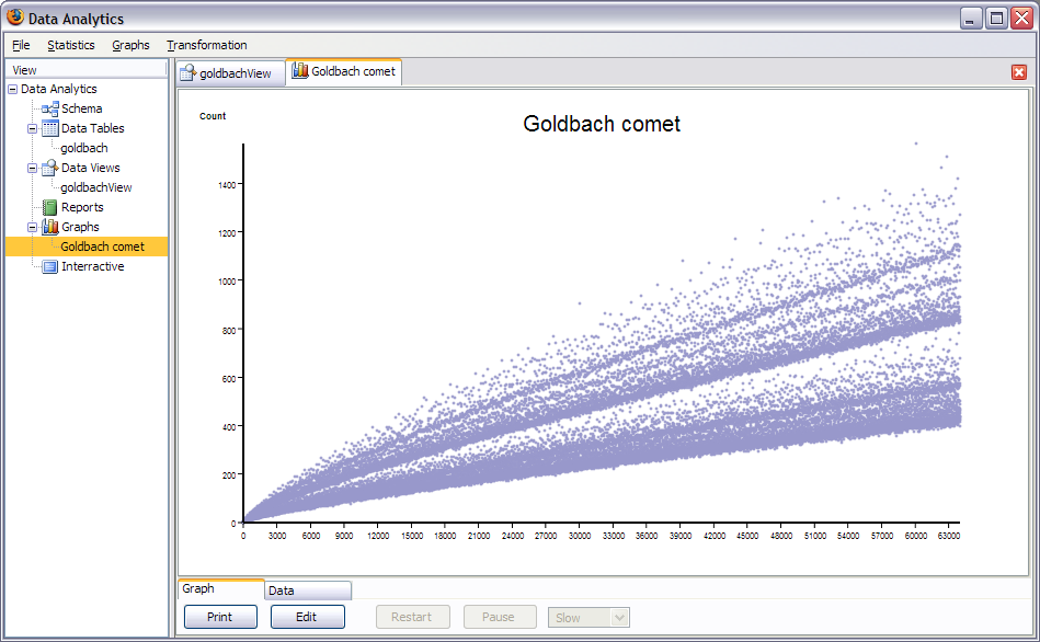
Let's draw the comet. Select scattered point plot of count versus number. Select a point size of 1 of shape diamond and we get
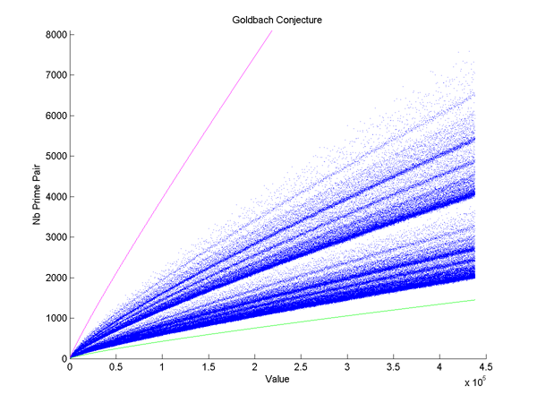
We can compare this image with Excel and Matlab:

With different calculations we can find the equation of the middle of the bottom band. Let's then add it to the plot. The function to generate the values of the band is
function FirstStripe() {


    this.name = "FirstStripe";

    this.label = "FirstStripe";

    this.config = null;

    this.result = null;

    this.createConfig = (function () {

        return null;

    } );

    this.process = (function (row, table, index) {

        this.result = Math.round((row.col0) / (Math.sqrt(2)*Math.pow(Math.log(row.col0 / 2), 2)));

    } );


}
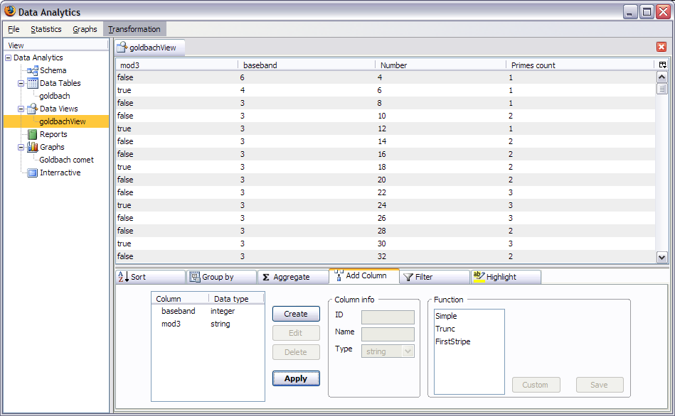
Once again verify that the column ids are correct. Call the column baseband for future reference. We also suppose that the upper section of the comet is made of the points whose number is divisible by 3. With the simple formula, create a boolean column called mod3 where number %3==0. The data should look like:
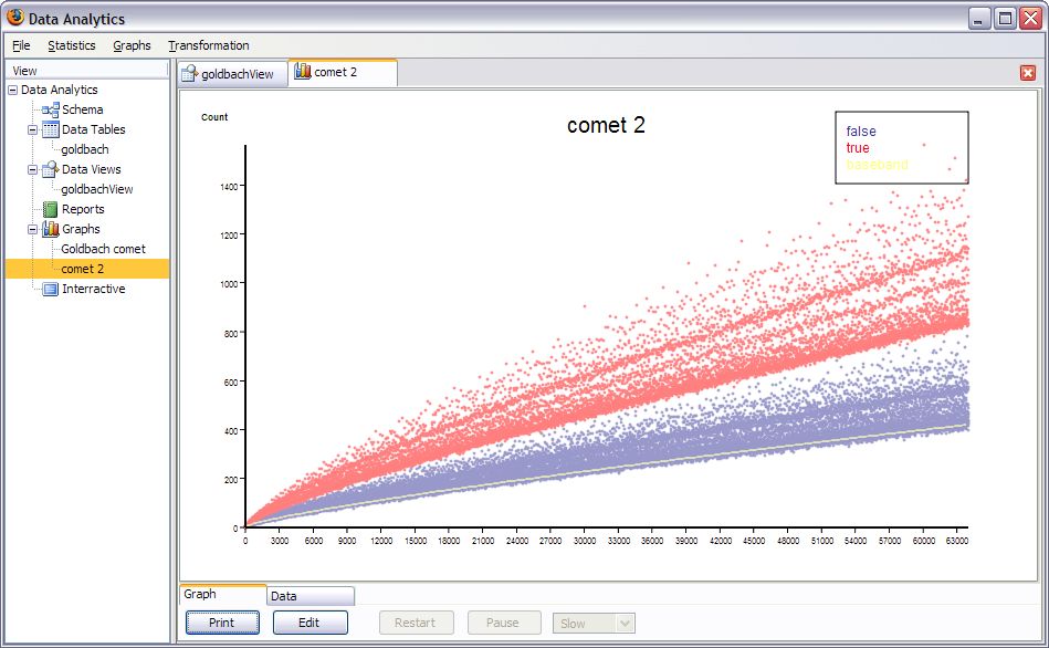
Lets now create the graph. The first series is the baseband. since it is a smooth curve select in the options to skip 100 values. This will improve performance. The comet then becomes a conditional series based on mod3. We obtain this nice chart:
Now that we have the equation for the first band, we can study the cross section of the comet. Let's first create a column for the "band multiple" for each points to measure the point's proportional distance from the first band. Simply divide the count by the first band. Call it "band" of type number. Once that's done we need to get the global cross section we need to transform the data table. Go to transformation / custom and write the following function: (You need to replace the 'goldbach' table name by the name you gave the table while importing and to replace the goldbachView_col3 by the id of the band column.)
function FullSection() {

        this.name = "FullSection";
        this.label = "FullSection";
       this.tableRegistry = null;
       this.newTable = null;

    this.DataAnalytics = null;


       this.process = (function () {
                var table = this.tableRegistry.goldbach;
                var width = 0.05;
                var len = Math.ceil(4 / width);
                var section = new Array(len);
                for (var i = 0;
                     i < len;
                     i++) {
                            section[i] = 0;
                }
                for (var i = 0;
                     i < table.rows.length;
                     i++) {

	section[Math.round(table.rows[i].goldbachView_col3 / width)]++;
                }
                for (var i = 0;
                     i < len;
                     i++) {
                            section[i] = (section[i] * 1000.0) / (table.rows.length);
                }
           this.newTable.init("cross_section", true);
                var col0 = this.newTable.newColumn("Index");
                col0.label = "Index";
                col0.dataType = new
	this.DataAnalytics.DataObjects.NumberType();
                this.newTable.columns.push(col0);
                var col1 = this.newTable.newColumn("Ratio");
                col1.label = "Ratio";
                col1.dataType = new
	this.DataAnalytics.DataObjects.NumberType();
                this.newTable.columns.push(col1);
                var col2 = this.newTable.newColumn("Percent");
                col2.label = "Percent";
            col2.dataType = new
	this.DataAnalytics.DataObjects.NumberType();
                this.newTable.columns.push(col2);
                for (var i = 0;
                     i < len;
                     i++) {
                            var dataRow = this.newTable.newRow();
                            dataRow.Index = i;
                            dataRow.Ratio = i * width;
                            dataRow.Percent = section[i];
                            this.newTable.rows.push(dataRow);
                }
        } );

}
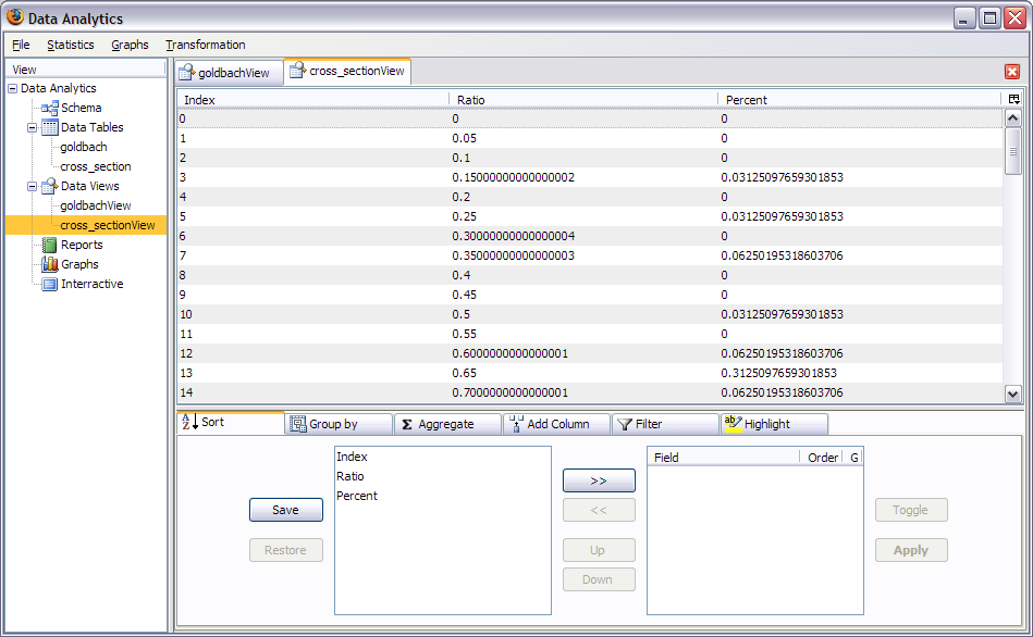
We obtain a new table like this:
We now plot the percent against the ratio:
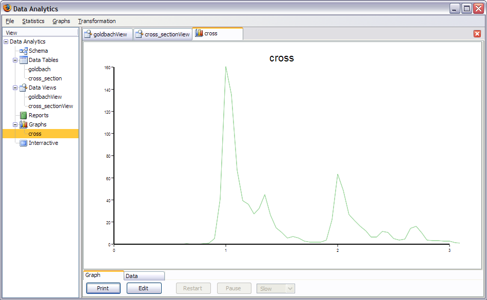
This graph represents the density of points in every band for the whole 32000 points. 32000 is large enough to be split in subsets if we call each subset a frame, we get an animation! First of all we need to generate the data for the frames. Here's the transformation: (Replace the name of the table and id of the column).
function FrameSection() {

    	this.name = "FrameSection";

    	this.label = "FrameSection";

    	this.tableRegistry = null;

    	this.newTable = null;

     this.DataAnalytics = null;


    	this.process = (function () {

        	var table = this.tableRegistry.goldbach;

        	var width = 0.05;

        	var nbPerFrame=500;


        	this.newTable.init("section_frames", true);

        	var col0 = this.newTable.newColumn("Index");

        	col0.label = "Index";

        	col0.dataType = new
this.DataAnalytics.DataObjects.NumberType();

        	this.newTable.columns.push(col0);

        	var col1 = this.newTable.newColumn("Ratio");

        	col1.label = "Ratio";

        	col1.dataType = new
this.DataAnalytics.DataObjects.NumberType();

        	this.newTable.columns.push(col1);

        	var col2 = this.newTable.newColumn("Percent");

        	col2.label = "Percent";

        	col2.dataType = new
this.DataAnalytics.DataObjects.NumberType();

        	this.newTable.columns.push(col2);

        	var col3 = this.newTable.newColumn("Frame");

        	col3.label = "Frame";

        	col3.dataType = new
this.DataAnalytics.DataObjects.NumberType();

        	this.newTable.columns.push(col3);


        	var len = Math.ceil(table.rows.length/nbPerFrame);

        	var len2 = Math.ceil(4/width)


        	var section = new Array(len2);

        	for (var i=0; i<len; i++) {

            	for (var j=0; j<len2; j++) {

                	section[j]=0;

            	}

            	for (var j = i*nbPerFrame; j < (i+1)*nbPerFrame; j++) {

                	if (table.rows[j]==null) break;

                    	section[Math.round(table.rows[j].goldbachView_col3 / width)]++;

                	}

            	for (var j=0; j<len2; j++) {

                	section[j] = (section[j] * 1000.0) / (table.rows.length);

            	}

            	for (var j=0; j<len2; j++) {

                	var dataRow = this.newTable.newRow();

                	dataRow.Index = j;

                	dataRow.Ratio = j * width;

                	dataRow.Percent = section[j];

                	dataRow.Frame = i;

                	this.newTable.rows.push(dataRow);

            	}

        	}

    	} );

	}
The code does the same as the previous transformation but separates the data points in frames. We get this table:
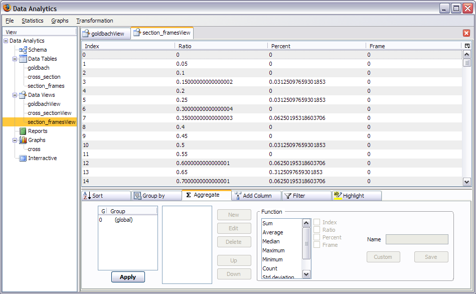
We the create the animation. After selecting animation, you get to this screen:
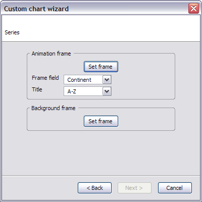
We don't need a background frame. The main frame is the plot of Percent versus ratio scattered. Select frame as the frame field and the ascending order is correct. Finish in the usual way.

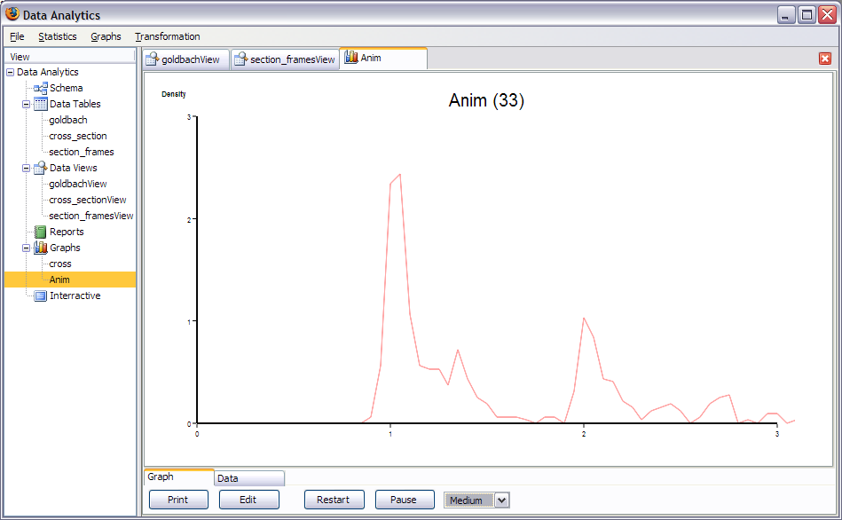
Although it is quite slow and processor hungry we see a great animation of the Goldbach cross-section.
That's the end of this tutorial, thanks for your time and I hope you will find this software useful.
Charles Verdon