Charts
Thanks to the new features in Firefox 1.5 nice charts can now be created. In addition to charts you can also create animations.
Wizard
To create a chart make sure you see the data you want plotted and click on Data/Graph.
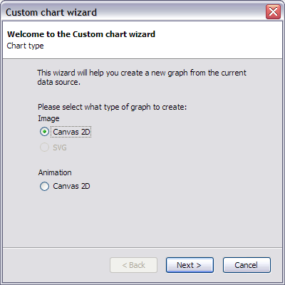
Thanks to the new features in Firefox 1.5 nice charts can now be created. In addition to charts you can also create animations.
To create a chart make sure you see the data you want plotted and click on Data/Graph.

Here you select the type of chart you want.
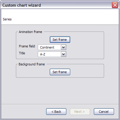
If you selected to make an animation you get to this page. An animation is two different otherwise normal charts. One is the main frame whose content changes and the other is constant for the whole duration of the animation. Click on set frame to create these charts. For the animation frame you need to select which field contains the frame identifier. The frame identifier does not need to be a numeric. The only thing important is that when sorted in the selected order, the values will make a frame.
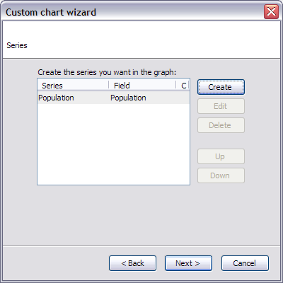
From this screen you can create your different series of data. Creating a series is explained in the next part of this document. The order of the series is significant: series above in the list will be drawn above (after) the ones under.
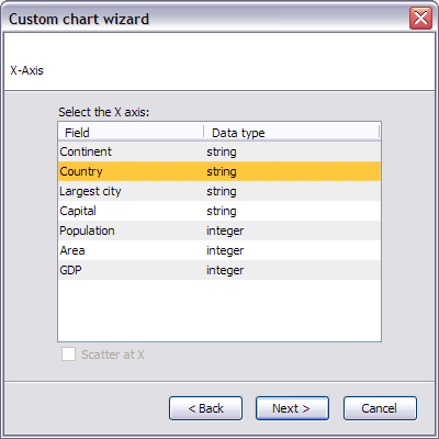
The X axis then needs to be selected. For numeric data the Scatter at X option allows to position data points at (x,y) instead of (index, y).
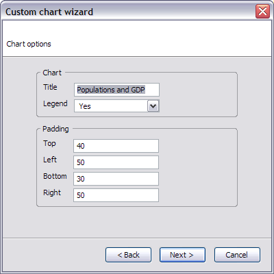
This is the first page of options for the graph. The padding region is used for the axis labels and the title.
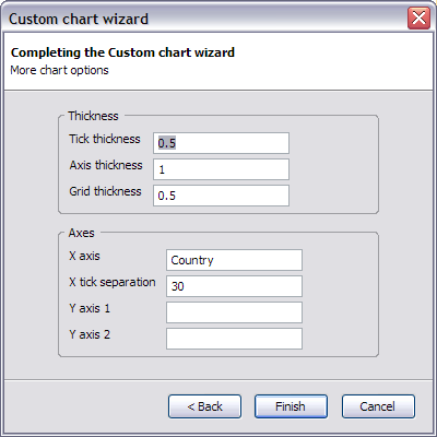
Various other settings can be modified. Up to 2 different axes can be used at the same time. If both axes are used one will be on the left and the other on the right. You can label them however you want.
Lets now create a series.
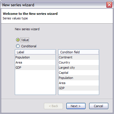
There are two types of series a simple value series is what you expect: a sequence of data points. A conditional series is not a single series. Its in fact as many series as there are different values in the condition field. For example a table could consist of 2 columns 1 for the academic achievement and the other for the sex. You can create simply a plot of both male and female scores as two series by using the conditional settings and selecting the sex as condition field.
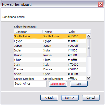
For conditional series, you can change the name and the color of the series. In the previous example you would decide that the series for sex M is to be called Male and to be plotted in blue, versus pink...
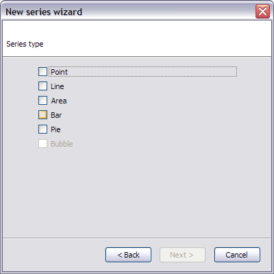
Here you select how the series will be plotted.
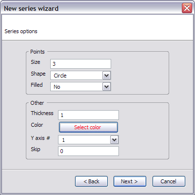
Next you can edit various options for the series. Some of these are disabled depending on the selection on the previous screen.
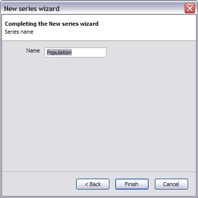
Finally you input the name for the series.
After all this configuration Data Analytics rewards you with some nice images:
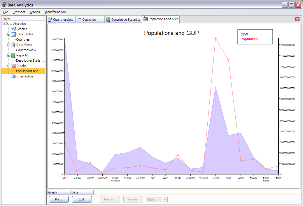
You can print the result although a bug in the Windows edition of Firefox makes the image tiny. You can modify the settings by clicking edit. For animations you can pause, restart and choose the speed. It's now up to you to make an animated pie chart!